Going from good to great CX
Everybody used to know that you couldn’t hide your features behind a bad customer experience. But as companies get even more digital, we now know that it’s not enough to have a good CX. You need a great one if your product is going to make it. And after almost two years of WFH, the tools we work in are no exception. Internal systems and B2B services also have to raise their bar, because they’re even more of a working environment now.
Actually, during this period of intense digitalization, we can see how products with comparable feature sets fare very differently depending on their customer experience. But even if this is clear, many organizations, release trains and teams often struggle with CX and UX. The two most common reasons are:
- Not enough UX:rs and designers to go around in the teams.
- Too much ‘Design Ahead’ — UX and design are still done in the old way, creating kilometers of screen sketches before anything is user-tested and developed. Design is still done in (very) big batches.
Both these situations create bottlenecks and queues for the customer experience development. These bottlenecks also lead to poor communication between competencies. This is only natural: If you don’t have enough designers for the teams, the people with different skill sets don’t get to spend enough quality time together!
Fortunately, there’s something that even completely cross-functional use to enhance the quality of customer experience that also works really well for reducing bottlenecks.
Let’s start storyboarding!

What is storyboarding?
There’s a great technique called story mapping. It’s very simple, yet very valuable. The idea is to get a better user perspective on user stories. By not only seeing them ‘as prioritized’, but as the user would see them — in the intended flow.
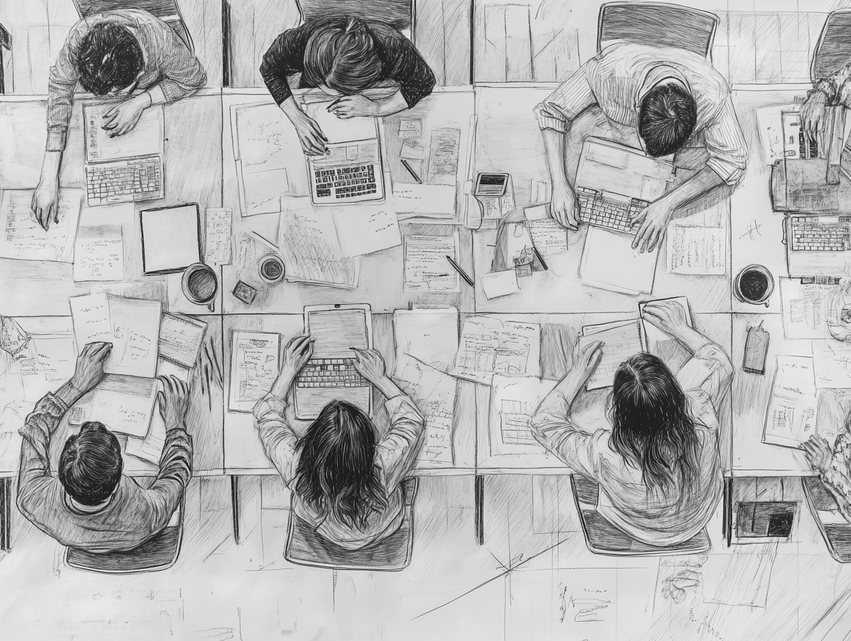
The whole cross-functional team, with all its functions present, sits down in front of a whiteboard. In other words, if you don’t have designers present daily in the team, they’re here for this exercise.
Putting user stories in their natural order from the user’s perspective
User stories are written down on Post Its and arranged horizontally in their natural flows on the whiteboard. (For instance, all the user stories relating to choosing the date and duration for a trip would be in the same flow, with the natural steps after each other.) The order of the stories is a group discussion, and when everybody agrees on the order of the flow, you start writing details for each story on Post Its placed vertically below that story.
This is a great way of placing user stories in their right context and having a deep discussion about them that enhances team communication and transparency between the different competencies of the team. You could say it’s a good way for everybody to ‘get to know the user stories. And when the first UX is developed, it’s informed by this discussion and in the other direction, the rest of the team recognizes what they see.
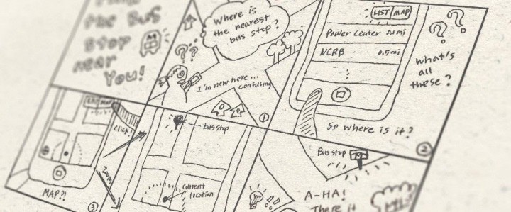
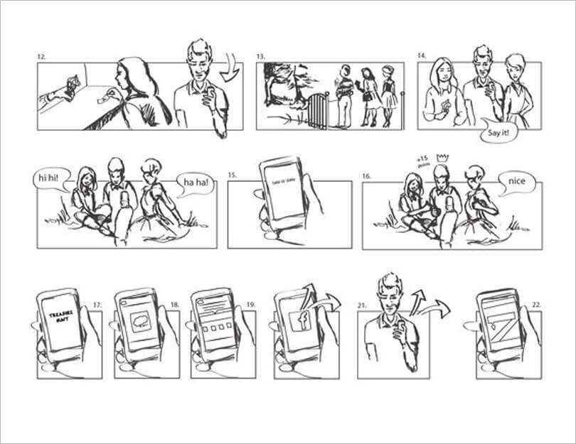
Storyboarding builds on top of this and adds something that everybody can see. Simple sketches of what a menu could look like, cartoonish drawings of situations when a feature will help the user.

How do you storyboard?
Borrowing from the world of film, the storyboard is a simplistic visualization of the user flow. Like in a cartoon, for each image the action progresses one step. (Or one crucial step.) In other words, interaction can be shown — this is the menu closed, this is the menu open — like in a cartoon. Sometimes you have more than one image per story to make ideas for important interactions clear, and sometimes the storyboard starts depicting the situation the user is in.
This has proven very valuable, because if I draw something — however crudely — you can come with input much easier because you see it as I intended it. There’s much less interpretation needed. So you can say ‘I see what you mean, but what happens if you put this thing on top of that?’
Visualizing context and flow
It doesn’t matter how good or bad you’re at drawing, the storyboarding is not about being pixel perfect but about visualizing context and flow. Capturing crucial situations with crucial user needs, as well as crucial interaction flows.
And the fact that you’re drawing visuals has some pretty great advantages. Usually, UX and designers are better than others at drawing and they’re also experts on interaction. So it makes good sense to let them have the pen (not monopolizing it, of course) but use it conversationally. In other words, everybody in the team comes with suggestions and the one currently with the pen tries to visualize them. ‘Do you mean like this?’

Why is it so valuable?
In other words, the ownership of what comes out is everybody. And the storyboard is used as a way to provoke questions and discussions about the different ways in which a flow could be implemented.
Like in story mapping, this gives the whole team a better understanding of the user value that they are supposed to deliver in this sprint. But since there actually have been things drawn, the team also has engaged in some ‘UX design light’. Other members of the team can then come with input much earlier than if you had to wait for ‘proper’ UX design.
And the designers get a chance to bounce very early ideas with their team members, making the UX design much more informed. Many UX designers do this in their sketchbooks as part of their toolbox and process. But the value created is much higher if you do it together with the whole team!
Transparency and shared ownership
The team can align on and get a much clearer, common vision of what the product will look like. Many flows and interaction-related issues are addressed together and before design, and that layer of creativity trumps the sometimes ‘requirements like’ approach when stories ‘tell’ designers how things should look and work, but mostly turn out not to work in the best way for the user.
And if you don’t have enough designers to go around in the teams, this is a great session where you interact with the designers in a way that involves the whole team and makes everybody part of the UX/CX work. You avoid the feeling of ‘farming out’ the UX work to another ‘department’.
Storyboarding also helps you get rid of big design batches: You only storyboards what’s relevant for a sprint or two, and then what’s on that storyboard is designed. And then you cover the next set of stories in a new storyboarding session with the whole team.
Any questions?


